Claude Custom Visuals is a new feature from Anthropic that lets you turn CSV data into interactive charts and dashboards directly inside chat.
Anthropic just dropped a feature most people haven’t tried yet.
You’ve been asking Claude for data analysis and getting back walls of text. Tables. Bullet points. Numbers you still have to copy into Excel just to make sense of them.
There’s a better way now — and most people haven’t touched it yet.
Claude can now turn your raw data into interactive charts using its new Custom Visuals feature. Upload a CSV, ask a question, and get a filterable, clickable chart right inside the chat. No exports. No extra tools.
Here’s what it is and how to use it in under a minute.
What Is Custom Visuals in Chat?
The official name is Custom Visuals in Chat — currently in beta.
You don’t need to turn anything on. Claude will automatically generate a visualization when it thinks one would be more useful than text, or you can just ask for one directly.
The key thing to understand: these aren’t screenshots or static images. They’re HTML-based interactive visuals rendered right inside your conversation. That means you can add sliders, clickable filters, and hover tooltips — and the visuals update in real time as the conversation continues.
One thing worth noting: Custom Visuals is only supported on Claude’s web and desktop apps. Mobile isn’t supported yet.
Why This Matters for Solopreneurs
Most AI tools can generate charts. But there’s always a catch — you get an image, a code snippet, or a file you have to open somewhere else. Excel, Python, a BI tool. There’s always another step between the insight and you.
Claude removes that step.
Upload a CSV, describe what you want to see, and the chart appears right there in the chat — interactive, filterable, and ready to act on. No exports. No setup. No switching tabs.
For solopreneurs managing everything alone, that’s not a small thing. Here’s the kind of analysis you can run without touching another tool:
- Revenue trends — see what’s growing and what isn’t
- Client performance — compare who’s actually driving your business
- Marketing metrics — figure out what’s working before you spend more
- Expense breakdowns — spot where the money is quietly going
What Kind of Data Can Claude Visualize?
Claude works best with structured data like CSV files. If your data has clear columns and rows, it can usually be visualized immediately — no cleaning required.
Common examples include:
- Sales exports from Stripe or Shopify
- Marketing data from Google Analytics
- Newsletter performance metrics
- Freelancer revenue tracking
- Product sales reports
In most cases, you don’t need to heavily clean the dataset beforehand. Claude reads the column names and builds the visual automatically.
From CSV to Interactive Dashboard in Two Prompts
Let me show you how to upload a CSV file and turn it into an interactive dashboard using Claude Custom Visuals.
The Data
For this example, I used an e-commerce sales dataset from Kaggle — Amazon Sales Report. The original file was too large to upload directly, so I trimmed it down to 10,000 rows before uploading. That’s a good habit to build anyway — smaller files load faster and Claude processes them more cleanly.
It doesn’t matter where your data comes from. Claude reads any CSV the same way.
Prompt 1 — Visualize the Data
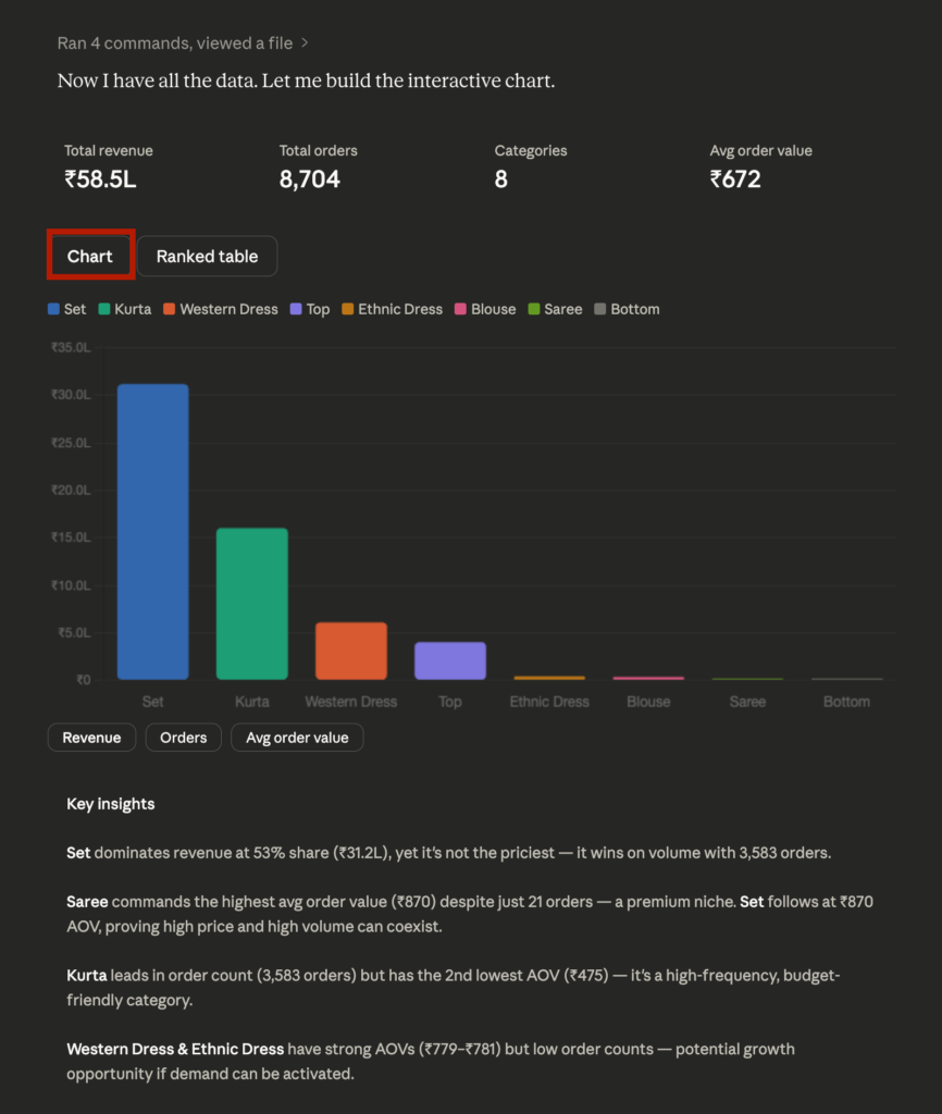
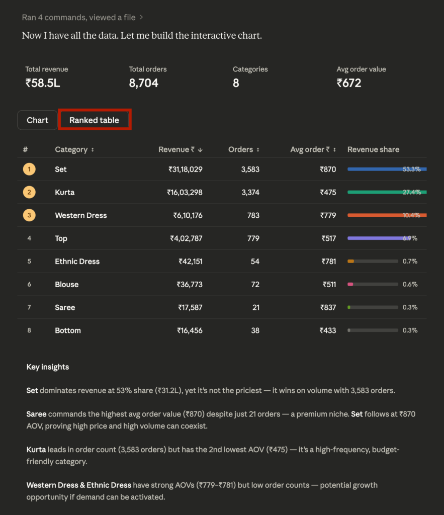
“Show revenue by product as an interactive chart and rank them by revenue, orders, avg order value, with insights”
Here’s what came back:
- A Chart tab and a Ranked Table tab you can toggle between
- Inside the chart, buttons to switch between Revenue / Orders / Avg Order Value views
- Key Insights generated automatically below the chart — not just labels, actual observations about what the data is telling you
No formatting. No follow-up needed. One prompt, one complete visual. You can directly interact with your data in Claude.
Prompt 2 — Drill Down by Category
“Show me how to boost sales for categories other than just Set and Kurta in the data”
Claude didn’t just re-draw the chart. It went further:
- A SELECT A CATEGORY toggle to switch between underperforming categories
- For each category, GROWTH TACTICS generated automatically — specific, data-grounded action steps, not generic advice
- The kind of output you’d normally expect from an analyst, not a chat window
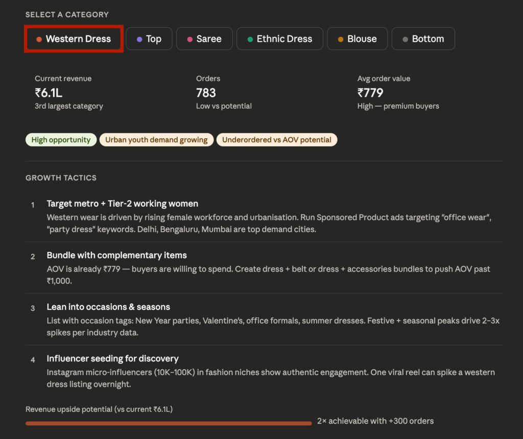
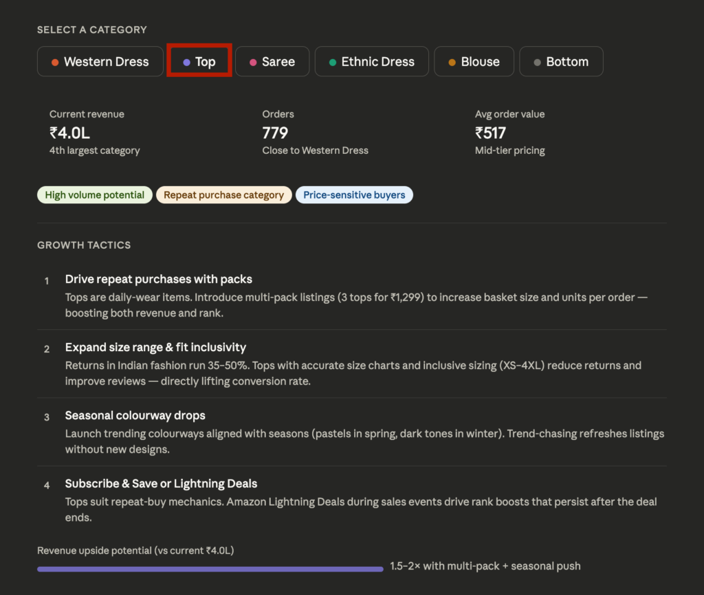
You can simply extend your analysis without switching to a separate BI tool.
This Is Just One Example. Here’s What Else You Can Do.
The e-commerce example above is one use case. Here’s what solopreneurs are actually using Custom Visuals for:
💰 Revenue & Finance
- Monthly revenue trend with a date slider
- Income vs. expenses toggle view
- Expense breakdown by category with a clickable pie chart
👥 Clients & Sales
- Client-by-client revenue comparison
- Sales channel drilldown chart
- Product sales over time with show/hide per product
⏰ Productivity & Operations
- Work hours by category as a weekly pie chart
- Task priority matrix
- Project timeline and Gantt chart
📈 Marketing & Growth
- Freelancer earnings by platform comparison
- Sales by day of week heatmap
- Lead source performance toggle chart
A Few Things to Keep in Mind
It’s still in beta. For complex analysis or large datasets, using a more powerful model like Opus or Sonnet Max will give you more stable, consistent results. If something doesn’t render the way you expect, try upgrading the model before assuming the feature is broken.
Visuals don’t auto-save. The charts exist inside your conversation — they can change or disappear as the thread continues. If you want to keep a visual, export it as an image or file before moving on.
Web and desktop only. Custom Visuals doesn’t work on iOS or Android. If you’re on mobile, you won’t see the interactive output — just text.
FAQ
Custom Visuals is a beta feature in Claude that generates interactive charts, diagrams, and dashboards directly inside your chat. Unlike static images, these visuals are HTML-based — meaning you can click, filter, and adjust them in real time.
Yes. Upload a CSV file into Claude and describe what you want to see. Claude will generate an interactive chart or dashboard based on your data without any additional tools or setup.
Yes. Custom Visuals creates HTML-based interactive charts — including bar charts with toggle filters, line charts with date sliders, pie charts with clickable slices, and scatter plots with hover tooltips.
Claude can generate dashboard-style visuals from structured data like CSV files. It won’t replace dedicated BI tools like Tableau or Looker, but for quick analysis and fast decision-making, it’s often much faster to get to an answer.
No. Custom Visuals currently only renders on Claude’s web and desktop apps. The feature is not supported on iOS or Android at this time.
Claude Custom Visuals works best with CSV files and structured tables. If your data is stored in Excel, simply export it as a CSV file and upload it directly into the chat — Claude will handle the rest.
Try It Yourself
Upload a CSV file, paste the prompts from this article, and see what Claude generates.
You might be surprised how quickly raw data turns into something you can actually make decisions from.
If you find an interesting use case, share it in the comments — I’m curious what kinds of datasets people are experimenting with.